
REBRANDING FOLGERS COFFEE
Paper or Plastic (Harvard GSD Course VIS 2415) | 09/2019 |
Instructors: Teran Evans, Teman Evans
Team Work with Viviana Wei, Maria Roldan, Hanning Tsai, Marwa Albaadani, Haoming Fu
Project Overview
The American coffee brand Folgers has long been the leader fro ground coffee, but now the trend is changing. With the research of coffee market, we target a new group of the young Hispanic Americans which has a huge potential in the future. The new sub-brand is called Sueno with the tagline of “dare to dream”.

Background Research
For a long time, Folgers was the pioneer its industry, completely dominating the market, though it still is -- it simply isn’t as up to par in its growth as it used to be, evident by the increasing competition and its 4% loss in market share.
However, if we look closely at the data we see that this decrease is simply relative to the growth of the coffee industry in recent years, but we chose to see this more as an opportunity than an issue.


Problem and Opportunity
By looking to the numbers, Latin Americans consume the most coffee in the US. While they have the highest purchasing potential for our product, this is not a group that is addressed by any one of our other peers in the ground coffee market. So, we thought, how can we at Folgers maintain our current loyal consumers, while also capturing the biggest demographic wave since the baby boom.


Solution
Prior to coming up with our new name, we immersed ourselves in our new target consumer, who we labeled as the “Practical Dreamer” to reflect the millions of Latin Americans that immigrate every day to the United States in the search for the American Dream. However, this comes with many challenges. Beyond just being both over-indexed and underrepresented in the coffee industry, Latin Americans typically find themselves working multiple strenuous service jobs day in and day out to make their dreams a reality. On top of that, they also have to deal with the President of the United States trying to build a barrier to physically prevent them from achieving their dreams. Our brand does the exact opposite. The famous iconic American brand will now address a more accurate image of the demographics in the United States.

BRAND DESIGN
Brand Name and Logo Design
Coffee plays a huge part of Latin culture, and so it is critical that our delivery of the brand is authentic and appropriate -- we thus decided to name our brand, Sueño. Sueño is a Spanish word that means both ‘dream’ and ‘sleep’. We specifically chose Sueño as a name because it contains the Spanish character ‘ñ’, which makes the brand easily identifiable to Spanish speakers; quite literally putting their culture on the shelf. As to the play between dreaming and sleeping, Sueño is meant to repeat Folgers’ history. We were particularly inspired by an expression that I personally grew up with, Vencer el sueño para alcanzar mis sueños, which means “wake up from your sleep to achieve your dreams”, which is what we plan to do for our consumer: be the helping hand that gives them a piece of home and powers them to get through the day and one step closer to making their dreams a reality.

Logo Design Drafts
Brand Personality
So WHO is our customer? Meet Olivia. Olivia is 25 years old and single. She works as a cashier during the day, but needs coffee to keep herself perked up for her night job as a waitress. She usually drinks coffee about three times a day; one at breakfast and the other two during her day job. Olivia is ambitious, energetic, and determined and dreams to become a high school math teacher, so she uses her spare time to teach herself after work.
Our research indicates that there are a lot of Olivias out there, and even closer to us than we thought, so we took some time to hold some interviews to try to gauge their coffee habits.


Brand Theme Color
As part of the next step in our development, we thought a lot about how to make our brand as true to our consumer as possible which starts primarily with visuals. Within the ground coffee industry, especially among our primary and secondary competitors, the main colors mainly occupying green and red. In order to represent the Latin American coffee experience and culture, we wanted our consumer to experience Sueno in a bold and lively color, so we chose “Coral”, representing energy and excitement”. We paired it with yellow to represent “vitality” and “hope” and purple which represents “creativity” and “wealth” to align with the ideals.


Products
Beyond the brand personality, we also wanted the actual product to align with our consumers’ lifestyles, and we turned to user testing with the original brand to try to understand their thoughts. The first thing we learned is that they were not initially big fans of the ground coffee! We actually came to find that Latin Americans invest a lot in the quality of their coffee and usually consumed coffee as a drink more so than a beverage. So, how do we replicate the experience that these consumers yearn while maintaining affordability, and the flexibility that comes with leading such a fast paced, busy lifestyle?
Major Product Line - Drip Bag Coffee
The answer to this is to completely move away from the traditional ritual of ground coffee by brewing in a coffee machine. We looked to alternative methods that would solve the problems that currently prevent our consumer from engaging with our parent brand.
We found that drip bags, which are most commonly used in Asian countries were exactly what we were looking for! After product research, we actually found that the main drip bag brands use the same drip bag designed by a Japanese company in the 90s. However, as it exists, it manages to solve only part of our problem.

We can see that the original shape allows the coffee to exit from the edges of the drip bag, often leading to tasteless coffee, and we began to search for ways to innovate the drip bag such that it maintains the maximum amount of flavor,
We went on to redesign the original filter into an elegant pyramid shape to provide our consumer with not only the stronger flavor that they need and a faster brewing process to suit our Dreamers’ tastes, thus securing the accessibility, portability, and quality of the product for our user.

Product Attributes
This new product line will be focus on drip bag coffee for its high quality, easy assembly, sustainability, convenience and future market opportunity.


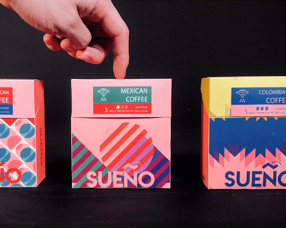
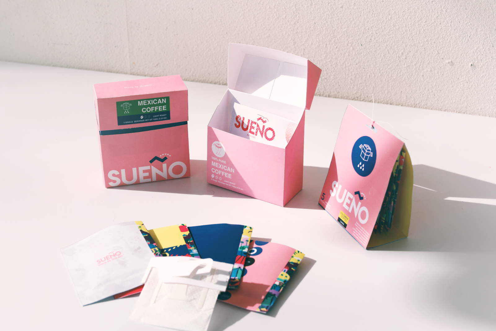
Packaging Design
The advantage of using the drip bag is firstly that it’s super convenient! However, when looking at the boxes of competitors’ packages in the current market, it is too hefty to carry around.

Inspired by the cigarette box, we designed our drip bags, the goal is to maximize the portability and make our product even easier to put into our pocket. Inside the box there will be 5 bags which are just enough for their daily needs. This package will be 60% smaller than the ordinary package you see in the market and is optimized to take up only necessary space, which other brands cannot speak to.
Maximize its portability
Design for daily drink
Smaller Size
In terms of the size, we have 2 different sizes: a single-serving triangular prism package and 5-serving cigarette box. Having a small size is good for portability and saving cost, because people might be skeptical to buy a giant box of stuff they have never heard of.


Color also plays a big part in gathering Hispanic consumers attention on the shelf. When presented with several designs to out interviewees, they were most responsive to bright and eye-catching colors, so we decided to feature popular colors from Costa Rica, Colombia, and Mexico on our external packaging.
As for the pattern you see on the boxes and inner packages, we decided to take an abstract approach to include the landscapes of Hispanic countries from photographs or postcards, and the circle and triangle are similar to Folgers iconic mountain and sunrise, which we believe serve a similar mission as our new brand.


Pricing
With that, we strategized on what the best pricing system to use was and decided on $1.49 for our single serving and $5.99 for our 5-serving product. So, our prices are slightly cheaper than our competitors to differentiate ourselves. As soon as customers see it on the shelf they can notice this $5.99 product right away. And then they find ours only have 5 servings not 10, so they calculate and figure out that $1.20 per serving is still much cheaper! Also, we are not being UNREASONABLY cheap. We don’t want new customers think of us with low quality.
Our Cost of Goods is 27 cents per serving, 22% of the price. Smuckers’ 2018 Annual Report shows its Coffee retail’s profit margin is 29.4%, which is really high. so if we set that profit margin as ours, pricing $5.99 means that we have half of the revenue to do R&D, Marketing & Sales, Distribution etc.


If the 30m Hispanic millennials, each of them buys 6 of our boxes annually, which is $36, 13% of their total money spent on coffee every year. Our annual sales revenue will be $1B


BUSINESS MODEL
We want to turn our packaging into a platform that will broadcast our ambition to the world. We want to celebrate empowering stories of Hispanic Americans flourishing within their communities in as powerful and animated way as possible. Our product is nothing if not the means to give these stories and products into the hands to the consumers.
we are developing a new mindset for our business model, besides just the B2C, where we would have revenue sources coming from retail and wholesale. We also decided to incorporate a B2B model, inviting enterprises and individual businesses to partner with us with special attention to growing Hispanic American businesses in America. A good example of this would be Broadway Marketplace, and as you’ve seen in the video, the manager Richard was very open to the idea. This would not only be a way to empower our target consumer with inspiring stories they can look up too but also a potential avenue for generating revenue through subscription plans and advertising.

There is a large opportunity ahead of us. Our TAM is over 30,000,000 consumers and partnering with over 4,000,000 local businesses, and we have laid out a strategic roadmap to execute our plan.

For the past semester, we have spent time considering customer empathy building, strategy development, and prototyping to enhance our design thinking. For the future outlook, we plan to do our initial product launch at Broadway Marketplace on January 1st 2020. In early Feb, we will start optimizing data to refine our ideas and products, and then expand to the Greater Boston Area in March. Following that, we will continue expanding to three other states that have the largest hispanic community and coffee consumption rate, and we’ve pinpointed them to be Florida, Texas, and Seattle. Eventually, by 2021, we are expanding our market to all 50 states.

So, we are SUENO, and we are now an international coffee company that aims to empower our Hispanic community by promoting their coffee culture, local businesses, and exhibit their culture and anecdotes of success to the rest of America and the world, especially at a time when it is in dire need of it!


TEAM SUENO