
ALIBABA A20
Data Visualization
Internship in Alibaba I May 2019
Data Visualization for Alibaba 20th Anniversary
Teammates: DiShen
Video: Individual
Project Overview
In September 10th, the conference celebrating Alibaba's 20th anniversary will be hold in the Olympic Center in Hangzhou. This project is intended to show how the information of the site as well as how people can enter and exit the stadium accordingliy.


Intro: Alibaba’s 20 anniversary
Founded in 1999, it will be Alibaba’s 20th year by September 2019. There will be around 60,000 people on the celebrating event and the site will be in the Olympic Center in Hangzhou. With the headquarters in Hangzhou and Beijing Alibaba Group has offices around the world, people will gather together and it is important for event organizers to view people’s information and data during the event (or even before the event).

Setup 3D Scenes
The first part of the project is to setup the 3d scene as a fundamental basement for our data visualization as well as a intuitive way to introduce the site to all the people joining the event. In this process, we use data from Streemap and city engine to create the 3d scene. The detailed stadium model was also refined at the same time.


Visualize Data
The next step and maybe the most important part is define the ways to visualize different data. According to Maitland Graves' principle of aesthetic order. We use all these basic attributes like orientation, color , shape and value to represent the data with different charts.


Finally the format was settled with all kinds of data type we want to visualize. Each of them corresponds to some charts that are suitable and easy to read. Also we design the layout by hierarchies and logical orders with reasonable graphic style.


Storytelling
Our scenes are divided by 3 different scales, from a global scale to the city regional scale. In the global scale we show the data of flights, the national scale shows the train information and the city scale is focus on how people are booking hotels. With the transitions between scenes, these three scenarios become a whole story.


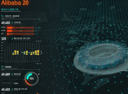
Real-time map
When looking at the stadium itself, we divide this complected building by 3 levels and 6 floors. People can see the realtime population density and attendant rates of all departments. As an individual, it will also be easy to know where are the closest entrances and exits.


Evacuation With Efficiency
Evacuation is a big challenge for big events. One important goal for the realtime data analysis is to have an efficient evacuation and avoid incidents. By knowing the quick ways to leave and how to avoid crowds, people will choose the best route to get out of the stadium and be picked up by the nearby buses. The time statistics will also be shown on the screen so that the organizers can know the if people are getting into trouble and solve the problems.


AR Map Prototype
After finishing the data visualization board, one additional function of this project might be the AR map. We propose three different scenarios to use this new technology. One is to use marker on the guidebook or the 3d physical model and the other is to use marker-less plan to define the digital scenes. As we design the prototypes, the real web based AR function will be updated in the later process.


